Blog / UI UX design
What happens in a UX design phase, and what you get at the end
Design before code is not decoration. Here is what a UX phase covers, step by step, and what you should have in hand when it is done.
10 October 2026, 3 minute read
Clients sometimes ask whether the design phase can be skipped to save time. It can, in the same way that drawings can be skipped when building a house. Changing a screen in a design file takes minutes. Changing it after it is built takes days. Here is what the phase actually involves.
Start with the people and the job
We begin by finding out who will use the product and what they are trying to get done. That means talking to you, and where possible to a few real users.
The output is short: the main kinds of user, their goals, and the moments where the current way of doing things lets them down.
- 01
People and the job
Who will use it, and what they are trying to get done.
- 02
Flows
The path through each task, drawn as a simple diagram.
- 03
Wireframes
Plain layouts that settle what goes on each screen.
- 04
Visual design
The brand applied, with components collected into a design system.
- 05
Prototype
Screens linked together so the product can be tried before it is built.
Map the flows before drawing screens
A flow is the path someone takes to finish a task, such as placing an order or approving a request. We lay these out as simple diagrams first.
This is where most problems show up: a missing step, a dead end, a decision the user cannot make with the information on screen. Fixing them here costs almost nothing.
Wireframes
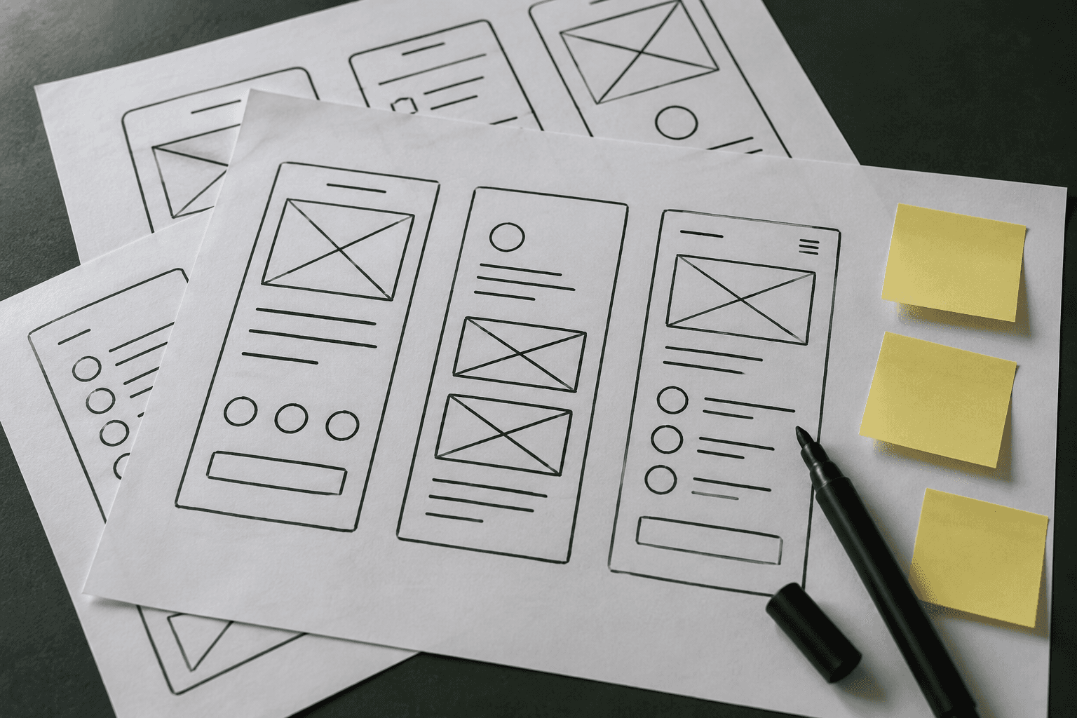
Wireframes are plain layouts with no colour or styling. They settle what goes on each screen and in what order. Because they look unfinished, people feel free to criticise them, which is exactly the point.
Visual design and a design system
Once the structure is agreed, we apply the brand: colour, type, spacing and components. The components are collected into a design system, so a button or a form field is designed once and reused everywhere.
That keeps the product consistent and makes it faster to build.
A prototype you can click
The screens are linked into a prototype that behaves like the real product. You can put it in front of users, investors or your own team before a line of code is written.
A few short test sessions at this stage catch the problems that are obvious to everyone except the people who designed it.
What slows a design phase down
The length depends on the size of the product. A small tool with a handful of screens moves quickly. A platform with several kinds of user takes longer, mostly because there are more flows to agree.
What slows the work is rarely the designing. It is waiting for feedback and for decisions. It helps to name one person on your side who can approve things.
What a design phase is not
It is not choosing colours, and it is not a set of pretty pictures to show investors, although it can produce those.
It is the cheapest place to find out that an idea does not work. If the prototype confuses the first three people who try it, you have just saved the cost of building the wrong thing.
It is the cheapest place to find out that an idea does not work.
What you should have at the end
A finished design phase leaves you with:
- User flows for the main tasks
- Designed screens for every state, including empty, loading and error
- A design system with reusable components
- A clickable prototype
- Notes for developers on behaviour and edge cases
With these, a development team can estimate accurately and build without guessing. That is where the design phase pays for itself.
Related service
UI UX design